CitiBite — Crunch series FMCG packaging
fmcg
Project details

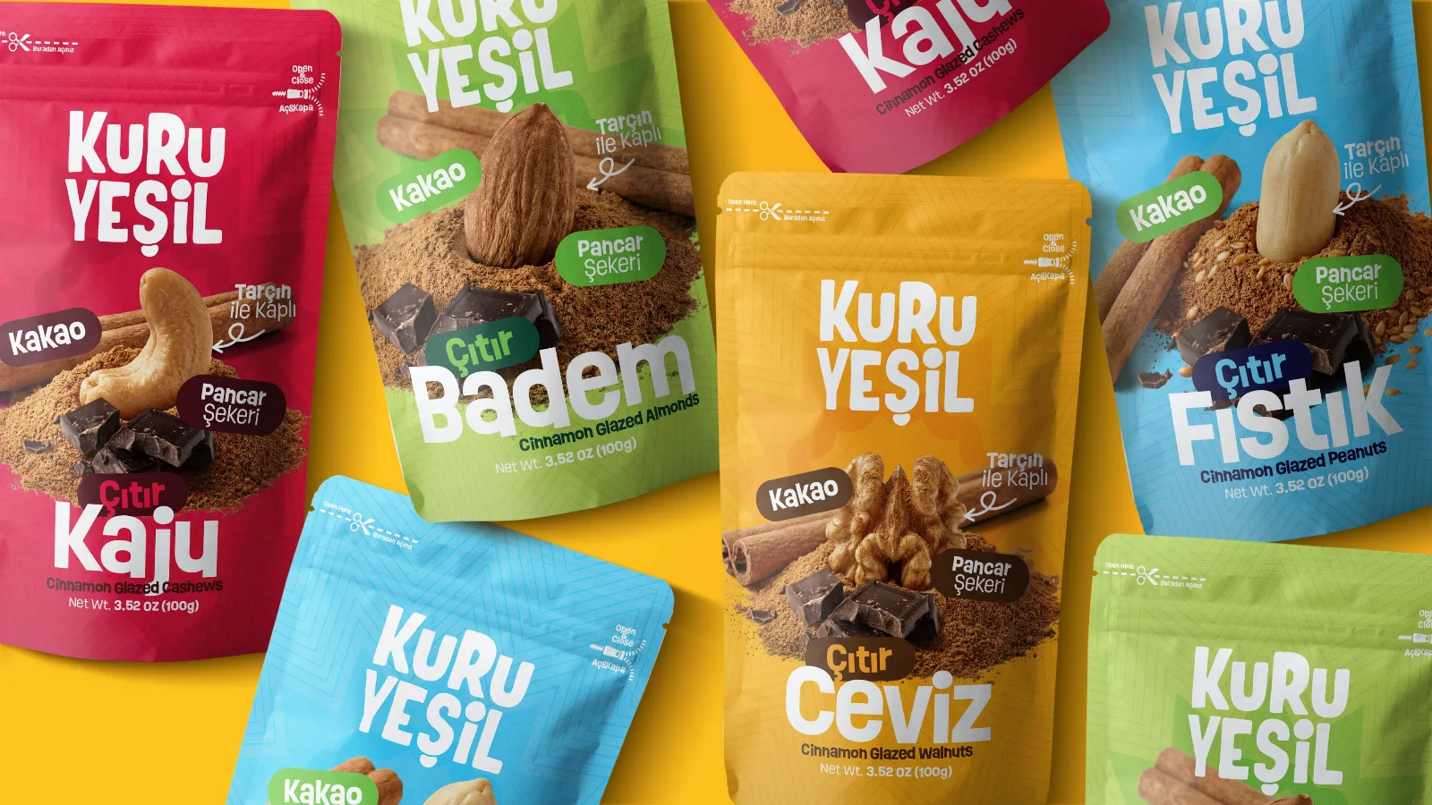
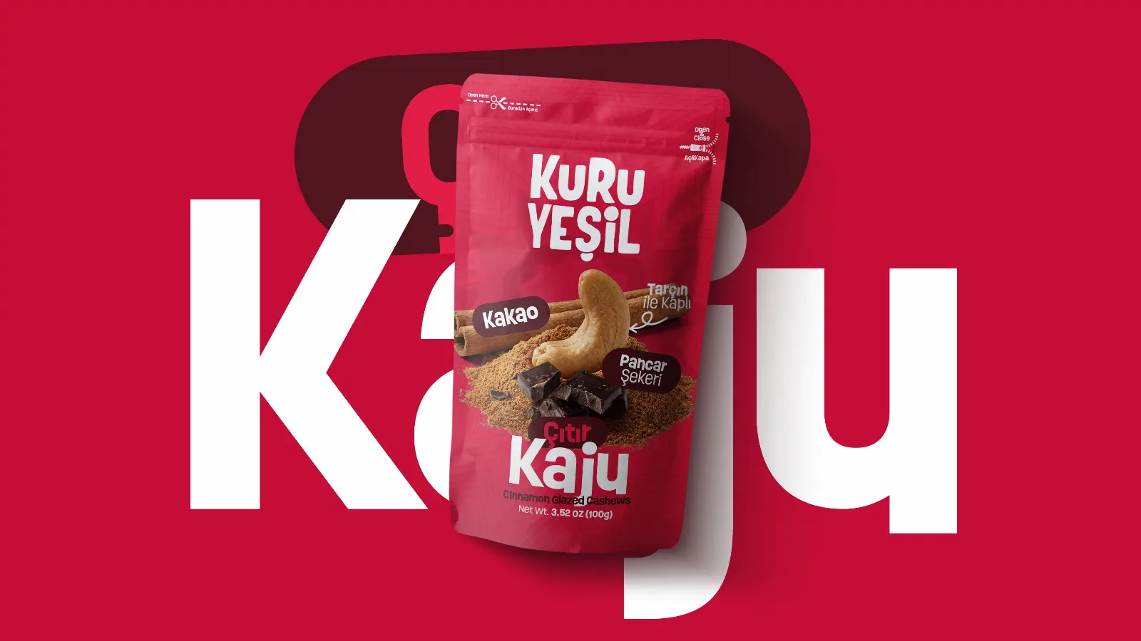
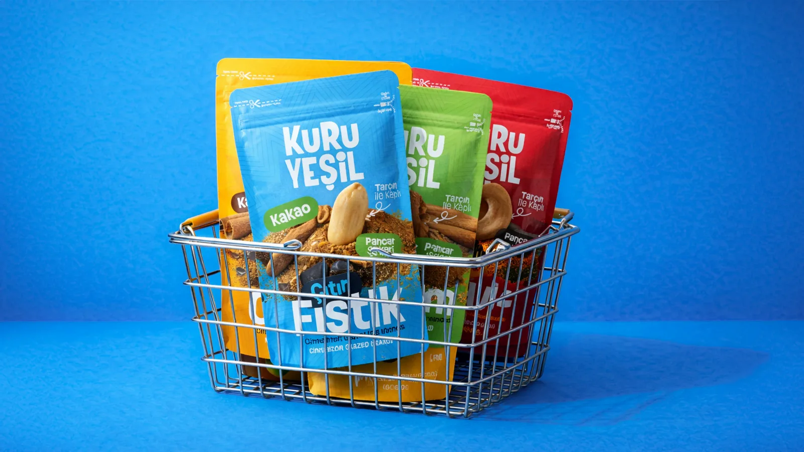
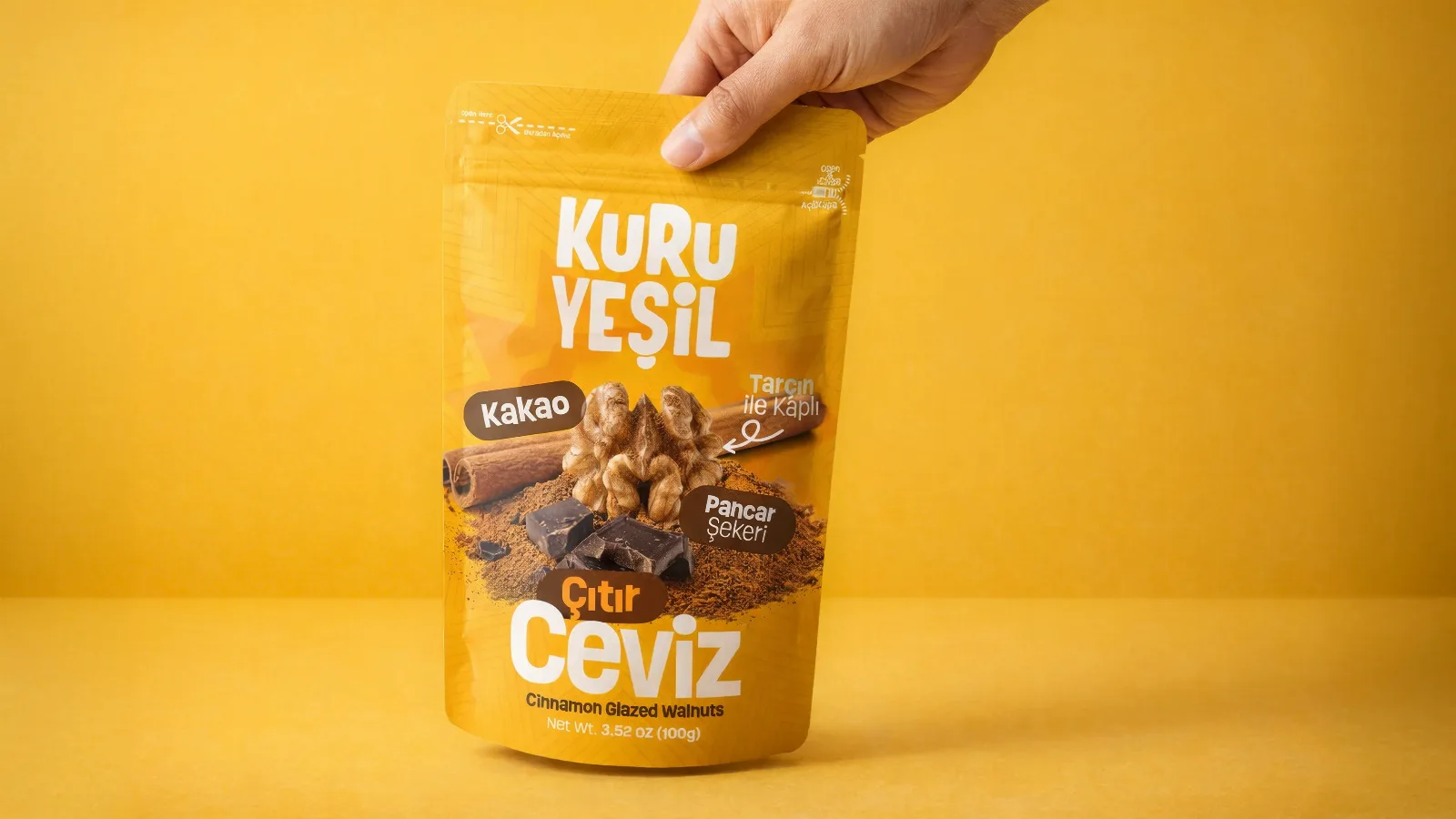
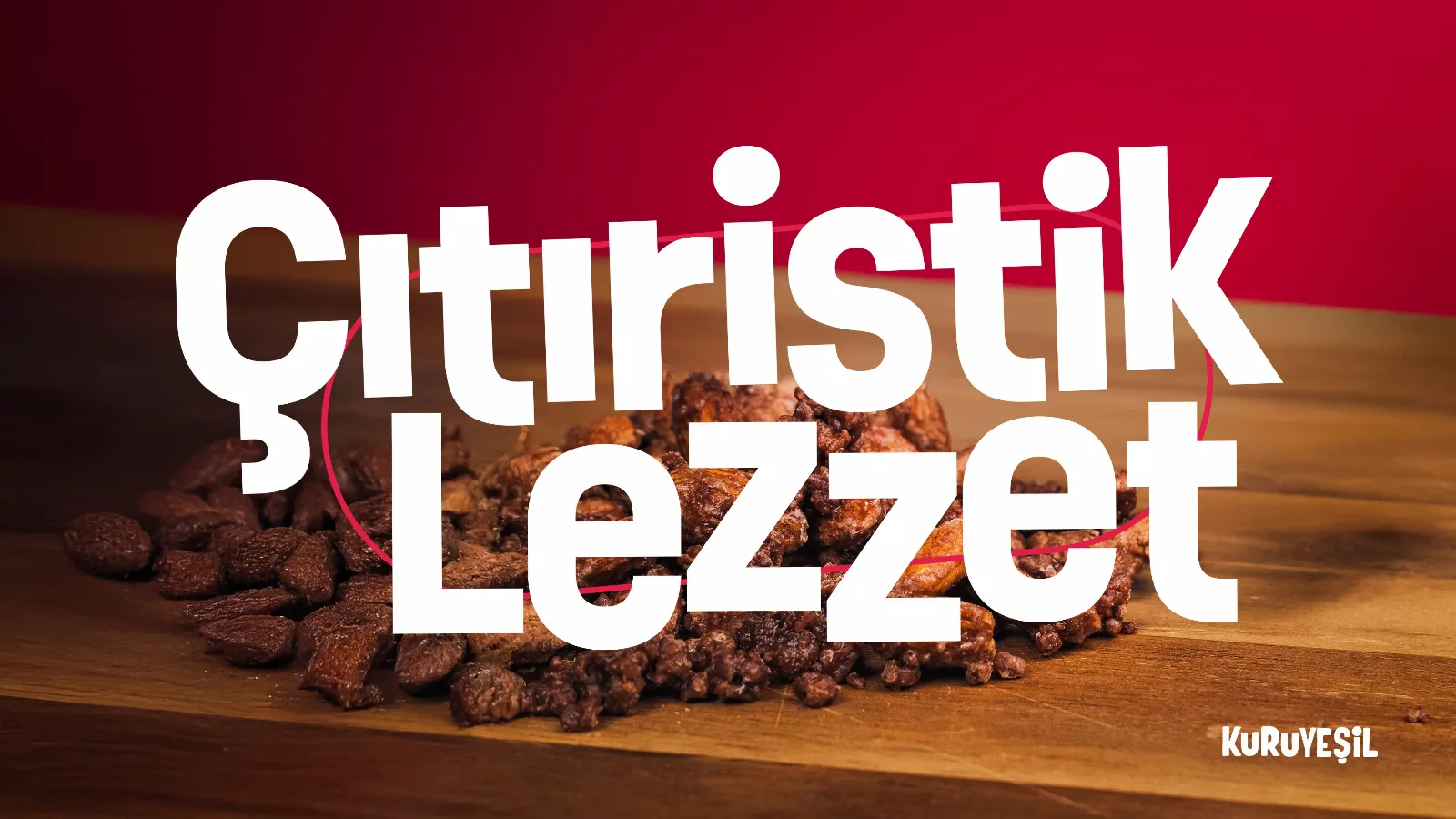
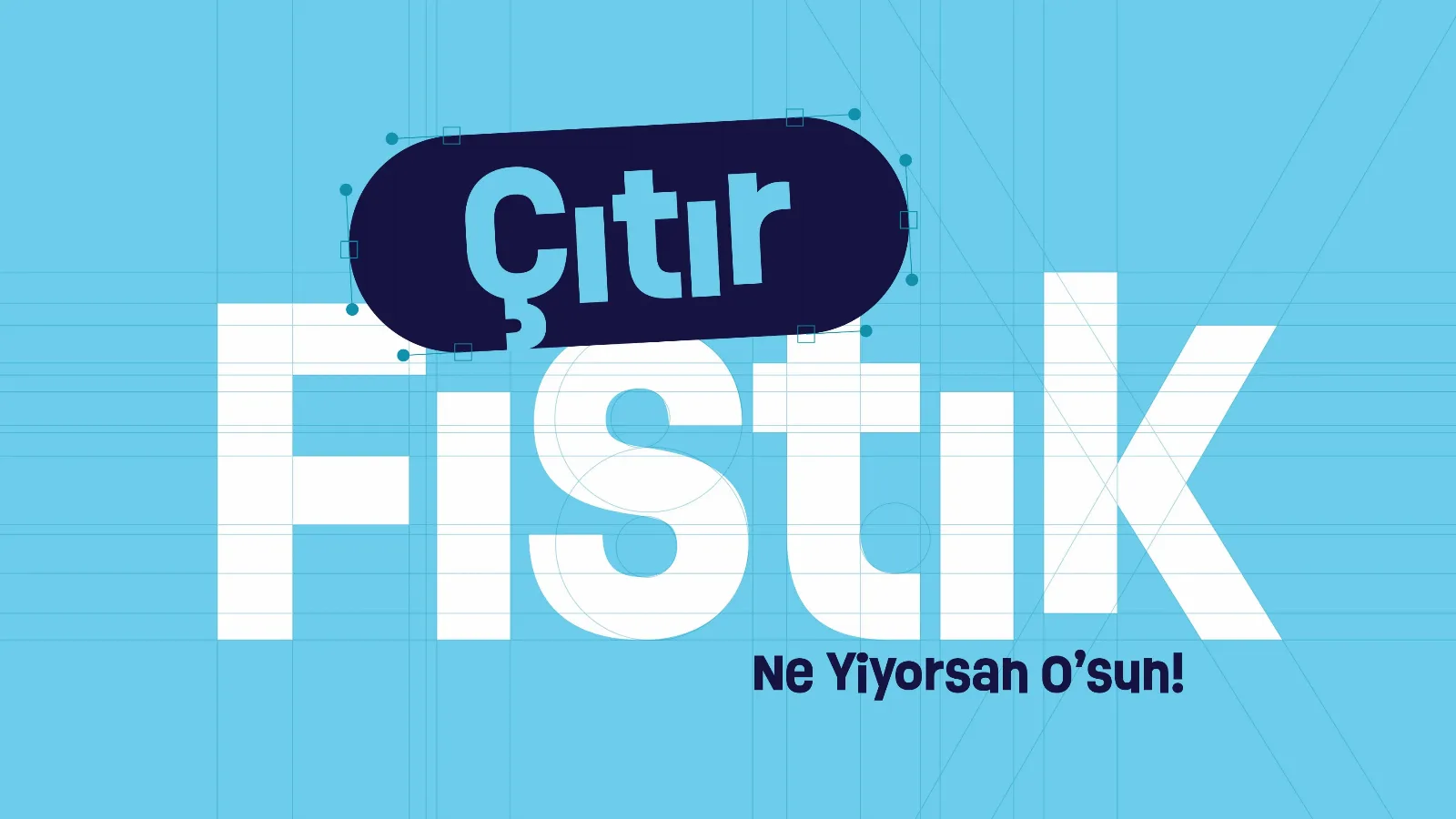
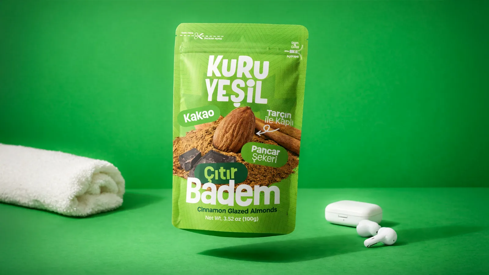
CitiBite expanded into a crunchy coated-nut series requiring a vibrant product packaging design language. We treated each nut type as its own character while maintaining a bold colour-block system for strong shelf impact in FMCG snack aisles.
Multi-SKU snack ranges are a core use case for our product packaging design studio serving Indian FMCG founders and marketing teams.
Project brief
- Four nut variants with cinnamon and chocolate coating stories
- Playful yet premium tone for urban retail and travel channels
- Clear flavour and ingredient callouts on small-format packs
Design approach
- Character-led fronts: Each SKU owns a colour and ingredient hero
- Series consistency: Shared typography, logo band, and crunch iconography
- Production: Artwork aligned to existing pouch supplier templates
Deliverables
- Variant artwork set with linked master styles
- Shelf strip and wobbler concepts for launch
- High-resolution mockups for digital campaigns
Scale your FMCG range with structured product packaging design—one system, many SKUs, print-ready delivery.
Deliverable
This portfolio item could not be found.