Blog
Corporate Profile Design: Best Practices for Governance-Heavy B2B Brands
By Funky Developers • 2026-05-19
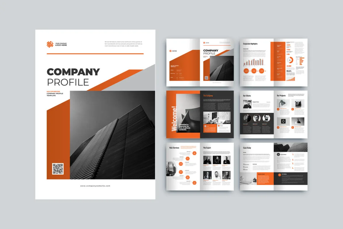
Corporate profile design tips for leadership bios, governance sections, ESG spreads, and staying visually aligned with annual report design expectations.
Corporate profile design carries a heavier burden than a startup one-pager. Stakeholders read it for tone, risk signals, and operational maturity. Boards skim leadership pages; procurement checks governance; international partners scan ESG language for consistency with other disclosures. The design system must whisper competence—quiet grids, disciplined type, photography that looks like your actual workplaces, not a stock fantasy of “business hands.”
Leadership bios in company profile: dignity and clarity
Leadership bios in company profile documents should balance warmth with formality. Use consistent lengths, parallel sentence structures, and portrait treatments that feel equal—no accidental hierarchy where one executive gets a full page while others shrink to captions. Designers set photo crops, name styles, and optional LinkedIn QR codes if policy allows. Legal often reviews titles; build margin for text reflow when “Acting” or “Interim” labels appear.
Corporate governance section design: readable, not decorative
Governance pages fail when they become grey walls of text. Use callouts for committee mandates, simple diagrams for reporting lines, and tables for charter summaries. Corporate governance section design should match language your annual filings already use—avoid introducing new terms that legal has not blessed. Visual rhythm helps board members actually read the page instead of skipping it.
ESG section in corporate profile: evidence over adjectives
An ESG section in corporate profile brochures tempts teams toward fluffy photography of leaves. Resist unless your metrics back the story. Prefer concise KPIs—energy intensity, water recycling rates, diversity ratios where disclosure policy allows—and pair them with timelines. Link out to fuller sustainability reports instead of duplicating hundred-page PDFs inline. Designers can create modular callouts so you refresh ESG annually without rebuilding the entire profile.
Annual report design alignment with profile
If you publish an annual report, keep typography, chart styles, and colour roles aligned. Annual report design alignment with profile reduces cognitive dissonance when investors compare documents. Shared chart palettes, consistent footnote styling, and harmonised photography treatments signal one finance and brand team—not siloed agencies fighting quietly.
Risk language, forward-looking statements, and footnotes
Corporate profiles sometimes include cautious legal language. Designers should reserve space for footnotes without breaking grids, and never shrink type below readable sizes to cram disclaimers. Work with legal early so line breaks look intentional, not desperate.
Production standards: print, digital, and archival PDFs
Corporate teams often need three exports: an email-friendly RGB with hyperlinks, a high-resolution CMYK PDF for print partners, and an archival version with embedded fonts and stable links. Document naming conventions and version numbers save procurement teams from uploading the wrong file by accident.
Photography direction for plants, labs, and campuses
Corporate profile design wins when imagery matches reality. Schedule shoots when lines run safely, when natural light helps—not only when executives are free. Capture both wide establishing shots and detail shots of quality control moments designers can pair with leadership bios in company profile spreads. Consistent colour grading across locations prevents the “patchwork” look common in global firms.
Designing for regulators versus customers
Sometimes the same PDF serves customers and regulators. Use layered storytelling: customer-friendly benefit statements up front, detailed compliance tables deeper in the document. Your corporate governance section design should feel calm—dense tables need breathing room, and callouts should summarise mandates before readers dive into legalese paragraphs legal insists on including verbatim.
Keeping ESG claims aligned with other disclosures
If your ESG section in corporate profile cites a emissions figure, it must match what sustainability reports say. Designers should build callouts that pull numbers from a single approved spreadsheet to reduce copy-paste drift. Icons can signal themes—energy, water, community—but avoid green clichés that contradict a heavy industrial photography set elsewhere in the profile.
Integrating micro-stories from operations without breaking tone
Corporate documents risk sounding sterile. Short pull quotes from engineers, safety leads, or implementation managers—approved through communications—humanise the firm without sounding like a consumer ad. Designers set pull-quote styles that differ from body copy but still feel sober. Pair quotes with micro-metrics (“average commissioning window reduced from X to Y weeks”) so sentiment stays grounded.
When annual report design alignment with profile matters, reuse approved portrait crops and typography from the annual report’s people section so leadership looks consistent year to year unless a deliberate refresh launches.
Board-ready PDF hygiene and meeting packs
Board members sometimes receive profiles as part of a larger meeting pack. Page numbers should survive printing double-sided. Table of contents links should work in Acrobat. Large photos should not balloon email over mailbox limits—provide a lightweight link version and a print version. For corporate profile design, these boring details signal operational maturity as loudly as the cover marque.
Freeze rules during sensitive news cycles
When incidents or M&A rumours hit, leadership may freeze public materials. Build a simple rule: who can authorise temporary takedown of downloads from your site, who updates numbers in the ESG section in corporate profile pages after investigations conclude, and how versioning records which PDF was live on which date. Designers appreciate explicit freeze windows more than whisper networks that “we might pull page seven.”
Aligning with investor relations and external PR
IR teams guard forward-looking language; PR teams guard crisis tone. Loop them early when corporate profile design includes metrics also appearing in earnings releases. Match rounding and definitions exactly. If PR plans a major story, decide whether the profile should wait for that reveal or ship earlier with embargoed sections redacted. Visual designers cannot resolve policy conflicts, but they can build modular redacted spreads once policy decides.
Design debt: when to refresh versus patch
Small annual patches work until typography, photography, and product architecture diverge too far. Watch for creeping font substitutions, inconsistent blues, and “temporary” pages that never leave. Schedule a deliberate redesign before the document embarrasses you in a board room. Leadership bios in company profile spreads often show age first—dated haircuts and old titles signal neglect faster than any chart.
Subsidiaries, joint ventures, and cross-border messaging
Group profiles must clarify which entity signs contracts in which geography. Designers can use subtle colour keys or tabbed section markers to separate subsidiaries without confusing readers. Align corporate governance section design language with how your annual filings describe control relationships. If you operate joint ventures, show logos proportionally and explain roles plainly—visual ambiguity here causes legal heartburn later.
FAQ
Should corporate profiles match the website exactly?
They should harmonise, not necessarily duplicate. Profiles carry deeper narrative; websites carry navigation breadth.
How often should we redesign?
Minor annual refreshes, major redesign every few years or after strategic pivots—whichever comes first.
Can we reuse annual report spreads?
Sometimes, with legal review for context changes and updated numbers.
Executive summary page: design it like a one-minute pitch
Busy board members may only read the opener. Treat the first interior spread after cover as a distilled argument: headline positioning, three proof metrics, three sectors, one risk mitigated, one call to action. Designers should tune type hierarchy so skimming works without reading body copy on page twelve. Align numbers with what IR approved so annual report design alignment with profile stays credible. If leadership wants poetry, keep it short—clarity beats cleverness in corporate profile design contexts.
Pair the summary with a tiny “document map” listing major sections and page ranges so heavy readers jump efficiently. That map doubles as an internal training aid for new sales hires learning where proof hides.
Coordinating legal disclaimers across web, PDF, and print
Disclaimers evolve. Maintain a single source file owned by legal with version IDs referenced in footer stamps across web PDFs and print runs. Designers should never paraphrase disclaimer language—import verbatim text after approval. When corporate governance section design pages include forward-looking statements, match phrasing to IR templates letter-for-letter. Mismatches between channels destroy trust faster than a weak cover photo.
Microcopy on charts: units, axes, and data freshness
Charts without labelled axes invite scepticism. Always state units (“INR crore,” “thousand tonnes”), time spans, and whether figures are audited or management estimates. Add a tiny “data as of” tag in the chart gutter. Designers should align chart microcopy styles with your annual reporting system so annual report design alignment with profile extends to the smallest text, not only big headlines. Readers forgive plain charts; they do not forgive ambiguous ones in rooms where someone will pause the meeting to ask what the axis means.
If leadership insists on dense sparklines, add a companion table with exact figures so accessibility and print legibility remain intact.
Corporate governance and design's role in regulatory communication
For listed companies, large private firms, and entities in regulated sectors, corporate profile design carries a compliance dimension that marketing teams sometimes underestimate. Governance pages must distinguish clearly between audited and management-estimated figures. Risk disclosures must follow the language your compliance team has cleared, not the energetic paraphrases your marketing writer prefers. Director bios must match the exact designations and committee memberships filed with regulatory authorities. When these details conflict—profile says one board size, latest filing says another—evaluators notice, and the mismatch raises questions about attention to detail across the whole organisation.
Design helps governance sections land with authority rather than feeling like legal appendices nobody reads. Typography hierarchy that leads with a bold governance statement before dipping into technical detail keeps evaluators engaged. A well-designed board composition table—clean lines, consistent photo treatment, concise role descriptions—reads as confident self-disclosure rather than grudging compliance. Sidebar callouts for key policies—anti-corruption, data protection, whistleblower—signal that governance is integrated into operations, not bolted on for appearances.
Work with your company secretary or compliance team early in the brief. They will identify mandatory disclosures, restricted claims, and sections that must appear verbatim from approved documents. Build those constraints into the brief so designers plan spreads around them rather than retrofitting them late. An annual report design alignment with profile check ensures both documents use the same governance language—inconsistency between two official publications is harder to explain than a simple error in one.
When your corporate profile serves international investors and partners
Profiles that travel across borders carry additional obligations and opportunities. International investors read governance sections through the lens of familiar frameworks—UK Corporate Governance Code, SEBI's LODR norms, IFC performance standards—and your profile should acknowledge whichever are relevant without overclaiming alignment you cannot substantiate. Mentioning that your reporting aligns with GRI standards, for instance, requires genuine programme evidence; a design callout without substance damages credibility with sophisticated audiences faster than silence would have.
Layout choices that feel standard domestically may read differently abroad. Long runs of dense text suit tender evaluators trained on government formats but exhaust international partners who expect executive summary openers. Consider a two-speed structure: a four-page executive digest at the front that international readers can digest in one sitting, followed by the full detailed section that domestic procurement and technical evaluators need. Both audiences get what they need; neither feels the document was written for someone else.
Currency and unit conversions deserve care. INR crore figures alongside approximate USD equivalents using a labelled conversion date help international readers without creating compliance obligations. Metric and imperial dual labelling for infrastructure dimensions prevents conversion errors in due diligence. Photography that shows genuine operations—manufacturing floors, technology infrastructure, client installations with written permissions—persuades international partners more credibly than stock imagery. When your corporate profile design travels into high-stakes international rooms, the investment in authentic proof pays back in diligence conversations that start from credibility rather than needing to build it.
Commissioning authentic photography for the modern corporate profile
In 2026, sophisticated readers spot stock photography almost instantly. A generic boardroom handshake on your corporate profile design cover communicates less about your organisation than a well-directed photograph of your actual team in your actual environment. Photography commissions do not require a large budget—a one-day directed shoot with a skilled photographer and a tight shot list can yield fifty to eighty usable images sufficient for a full corporate profile and supplementary marketing materials for twelve months.
The key is preparation. A shot list tied to your outline means every page spread has a corresponding scene planned: an exterior establishing shot for your facilities page, a process close-up for your quality section, a leadership environmental portrait for the governance spread, a team photograph for the culture page. Share the shot list with your studio in advance so they plan crop formats appropriate for each layout—a leadership portrait needs different framing for a full-bleed spread versus a circular inset. Photography taken without layout context often fails to fill the space it is needed for, forcing expensive reshoots or awkward crops.
Photography from real operations also strengthens the E-E-A-T signals your document sends to sophisticated evaluators: genuine machinery, real team composition, authentic environments. When your competitor submits a stock-heavy profile alongside yours, the contrast is immediately visible and immediately persuasive.
Elevate the flagship corporate story
We help organisations present leadership, governance, and proof with calm visual systems. Explore company profile design to see how we scope corporate programmes.
When your team is ready for a governed creative process, start from company profile design services and share your reporting calendar—we will respect both marketing ambition and compliance reality. For lighter updates between redesigns, follow our blog.
Bring your latest annual report PDF and your current profile—even if embarrassing—so we can calibrate corporate profile design gaps honestly in the first working session. Start from company profile design when you are ready for that conversation.
We aim to respond quickly during business days so governance reviews stay on track.
Related: company profile design agency · company profile examples.