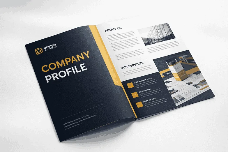
Most B2B company profiles share the same weaknesses: generic claims, dense unbroken text, stock photos that could belong to any company, and a contact page that lists only a mobile number. These are not difficult problems to fix — they are gaps in attention and process, and addressing them does not require a full redesign. This collection of company profile designing tips is organised into five practical categories: story and positioning, proof and credibility, layout and visual hierarchy, process and updates, and export and distribution. Each tip is expanded into a real explanation, not just a headline. Work through the ones that apply to your current profile and you will have a stronger document in less time than you might expect.
Story and Positioning Tips (1–4)
Tip 1: Lead with what you do, not who you are. The most common mistake in company profile introductions is opening with how long the company has been in existence before saying what it actually does. "Founded in 2009, XYZ Solutions has been serving clients across India..." tells the reader nothing useful in the first sentence. Lead instead with your core function and audience: "XYZ Solutions builds and maintains industrial ventilation systems for manufacturing plants across western India." Now the reader knows in five seconds whether this is relevant to them. Save the founding date for the credentials section.
Tip 2: Write one core message and build every section around it. The best company profiles are built around a single, clear positioning statement — one sentence that captures what the business does, for whom, and why it is different. Every section of the profile then either supports or amplifies that message. If your core message is "precision engineering for pharmaceutical packaging lines," then your services section, your team bios, your credentials section, and your client categories should all reinforce that specialisation. Profiles that try to appeal to everyone by listing everything they can do end up appealing to no one.
Tip 3: Treat the "Our Story" section as evidence, not emotion. A founding story is most effective when it explains not just how the company started but what problem it was built to solve. "We started this company because we kept seeing engineering teams waste weeks on procurement delays caused by fragmented vendor management" is a stronger story than "Our founder had a vision to transform the industry." The first grounds the reader in a real problem; the second is vague aspiration. Story in B2B is most powerful when it makes the reader think, "yes, that is exactly our problem."
Tip 4: One message per spread. In a printed or PDF profile, each two-page spread (or single page for digital-only versions) should communicate one primary idea. If a spread is simultaneously trying to introduce your services, list your awards, and present your team, the reader's attention is fragmented and none of the three messages land effectively. Assign each spread a primary message before the layout begins, and design everything on that spread to support that message. This discipline forces clarity and produces pages that are far more readable than those that try to pack in everything at once. This is what designers mean when they refer to a skimmable profile layout.
Proof and Credibility Tips (5–8)
Tip 5: Replace adjectives with evidence. Every time you write a claim like "highly experienced team" or "proven track record," ask yourself: what is the actual evidence? "Highly experienced" could mean a team with an average of twelve years in the sector. "Proven track record" could mean forty successfully completed projects in three years. Use the specific version — it is more persuasive and more honest. Proof points in profiles do not need to be dramatic; they need to be real.
Tip 6: Use numbers carefully. Numbers build credibility — but only when they are accurate, sourced, and specific. "Serving 500+ clients" is compelling only if it is true and you can explain what "serving" means. "Over ₹10 crore in project value delivered" is specific and verifiable. Do not inflate or round up numbers to sound more impressive — B2B buyers in India are increasingly good at asking follow-up questions, and a number you cannot defend damages your credibility more than not using the number at all. If you do not have compelling numbers yet, use descriptive specificity instead: industry experience depth, project complexity handled, geographies served.
Tip 7: List your certifications and registrations with their specific identifiers. "ISO certified" is weaker than "ISO 9001:2015 certified, certificate valid until 2027." "Government registered" is weaker than "MSME Registration No. XXXX." Specific identifiers can be verified, which signals confidence. They also demonstrate that the certification is current and maintained, not just a historic credential that has lapsed. Place these details on a dedicated credentials page or in a clearly labelled section — do not bury them in body text.
Tip 8: Let client categories speak if specific names cannot. Many businesses cannot name clients by contract. That is fine — list the categories and industries instead. "Clients include central government ministries, tier-1 FMCG manufacturers, and mid-market logistics companies" conveys calibre without violating confidentiality. If you can share the logos of clients who have given permission, do so — logo recognition is a powerful credibility signal and takes up minimal space.
Layout and Visual Hierarchy Tips (9–11)
Tip 9: Use white space as a design tool, not a waste of space. The instinct to fill every inch of a page — to feel like you are giving the reader value — actually reduces readability. White space around headings, between sections, and in margins reduces cognitive load and directs attention to the content that matters. If your current profile feels crowded, try increasing the margins by 5mm on each side and adding 12pt of space above every section heading. The profile will feel more professional immediately, even before any content changes.
Tip 10: Create a clear visual hierarchy within each page. Every page should have one dominant element (a large image, a standout statistic, or a key section heading), one or two supporting elements (body copy, secondary images, or subheadings), and a tertiary layer (captions, footnotes, page numbers). When everything on a page is the same visual weight, nothing stands out and the reader's eye does not know where to start. Hierarchy is not about making some content more important — it is about making the reading path obvious.
Tip 11: Align tables and icons to a consistent grid. Nothing signals amateur layout more quickly than elements that are almost-but-not-quite aligned. Set up a grid before starting your layout — for A4, a standard option is a 12-column grid with 5mm gutters — and snap every element to it. This applies to tables, icon rows, text boxes, and image frames. Consistent alignment is something readers feel subconsciously even when they cannot articulate it: a well-gridded page feels organised; a poorly aligned one feels hurried.
Process and Update Tips (12–13)
Tip 12: Schedule a yearly company profile update in your marketing calendar. A company profile that is more than 18 months old is almost certainly outdated in at least one significant way: a service has been added or removed, a certification has been renewed (or lapsed), leadership has changed, or the contact details are no longer current. Treat the profile review as a recurring task, not a reactive one. Set a calendar reminder for the same month each year — after your financial year closes is a natural time, since you will have updated turnover figures, new project completions, and a fresh view of where the business stands.
Tip 13: Separate content decisions from design decisions. One of the most common causes of project delays is conflating "what should we say" with "how should it look." If you start designing before the content is finalised, every content change triggers a redesign. Write and approve all text content completely before briefing a designer. This does not mean every word is set in stone — small edits during design are inevitable — but it means that the structural and substantive decisions are resolved before layout begins. Designers work faster and with fewer revisions when they are not waiting for content decisions to be made.
Export and Distribution Tips (14–15)
Tip 14: Maintain separate export versions for screen and print. A screen-optimised PDF (compressed, sRGB colour space, 72–150 DPI images) and a print-ready PDF (uncompressed, CMYK, 300 DPI images, with bleed marks) serve different purposes and should be different files. Do not send a 25MB print-ready file as an email attachment — it is unwieldy, it previews slowly, and in some cases it will be blocked by enterprise email servers. Equally, do not send a compressed screen PDF to a print vendor — the results will be noticeably inferior. Label your export files clearly and store both versions with version numbers.
Tip 15: Think about where the profile will be read before finalising the design. A profile that will primarily be viewed on a laptop or desktop screen has different design constraints from one that will primarily be printed and physically reviewed. Screen-viewed profiles benefit from hyperlinks (clickable email addresses, URLs, and phone numbers), interactive bookmarks for navigation, and RGB colour. Printed profiles need CMYK colour, bleed margins, and physical navigation cues (clear page numbers, section dividers). If your profile serves both contexts, build the print version first and create a screen-optimised version as a derivative.
Common Mistakes to Fix First
Before applying the fifteen tips above, check your current profile for these five immediate red flags: a cover page with no tagline or date, an About Us section longer than one page without any headings or proof points, a services section that uses the same descriptive language for every service, a contact page with no company email domain (only Gmail or personal addresses), and no page numbers or table of contents. These are the highest-impact fixes and the quickest wins. Addressing them alone will make a measurable difference to how your profile is received. If you want expert help applying all fifteen of these improvements, our company profile design team can audit your current profile and recommend a clear action plan.
Frequently Asked Questions
How do I make my company profile more skimmable for busy readers?
Use plenty of headings and subheadings, keep paragraphs to three to four lines maximum, use bullet points for lists of more than three items, and include a pull quote or highlighted statistic on every two to three pages. Busy B2B readers skim before they read — they will scan headings and highlighted content first, and then decide whether to read the full text. If your headings are generic ("About Us," "Our Services"), replace them with descriptive ones that communicate the key message of that section even to a reader who only reads the heading.
Should I include pricing in my company profile?
Generally no — company profiles are introductory documents, not quotation tools. Including fixed pricing creates problems: it becomes outdated quickly, it may not reflect project-specific pricing accurately, and it removes a natural reason to have a conversation with a prospect. The exception is if you offer clearly defined, fixed-price packages (e.g., a productised service with a set scope and price), in which case including indicative pricing can accelerate decision-making. If you do include pricing, make clear that all prices are indicative and subject to a formal project brief.
What is the right length for a B2B company profile?
Eight to twelve pages is the right length for most B2B company profiles. This is enough space to cover all essential sections (cover, about us, vision, services, credentials, team, contact) with adequate depth. Profiles shorter than eight pages often feel incomplete; those longer than sixteen pages risk losing the reader's attention. Manufacturing companies with extensive product ranges, or consultancies with many service lines, may extend to sixteen pages. Beyond that, consider splitting into a concise main profile and a supplementary technical or product catalogue.
How important are visuals versus text in a company profile?
Both matter, and they serve different functions. Text communicates substance — what you do, how you do it, why it matters. Visuals communicate quality, style, and trust — they signal that the business takes presentation seriously. A text-heavy profile with no visual design feels like an information dump. A design-heavy profile with thin content feels like a brochure without a product. The ideal balance is roughly 40–50% visual space (images, icons, whitespace, charts) and 50–60% text — a balance that reads well both on screen and in print.
Start Improving Your Profile Today
These fifteen tips are a practical starting point for any B2B team looking to strengthen their company profile without necessarily commissioning a full redesign. Pick the three or four that address your biggest current weaknesses and implement them in your next revision cycle.
For teams that want professional help applying all of these principles, our company profile design service covers everything from content strategy and copywriting to layout, export, and version control. Visit our blog for more practical resources on B2B communication and design.
A better profile is within reach — it often requires iteration and expertise more than a complete restart.