Blog
Company Profile Design: Simpler, More Impactful (Without Losing Credibility)
By Funky Developers • 2026-07-07
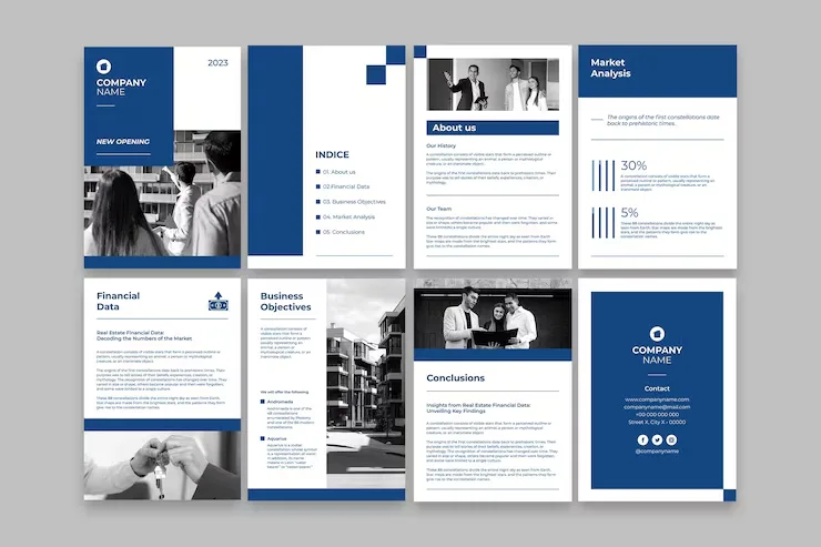
Why simplifying your company profile design increases credibility — editing principles, visual hierarchy, and proof point strategy for B2B documents.
Most company profiles contain more content than they need, and less clarity than they should. The instinct to include everything — every service, every award, every client sector, every credential — produces documents that are dense, hard to navigate, and ultimately less persuasive than a leaner, more focused alternative. Simple company profile design is not about removing substance. It is about editing ruthlessly so that what remains lands harder. This article explores the principles behind effective simplification — from content editing and text density to visual hierarchy and proof point selection — and shows why the best company profiles are almost always the ones that chose what to leave out.
Why Clutter Hurts Credibility
There is a counterintuitive truth about B2B document design: the more information a page tries to communicate at once, the less of it the reader retains. When a company profile page contains three competing headings, six bullet points, two call-outs, a full paragraph of body text, and a background image, the reader does not process it all — they skim it and move on, retaining almost nothing.
Clutter also signals uncertainty about what matters. When every capability, every sector, and every credential gets equal visual weight, the implicit message is: "We are not sure what you care about, so we included everything." That is the opposite of a confident, client-facing organisation. Buyers and evaluators — whether they are procurement professionals, investors, or senior management — are pattern-recognising readers. They notice when a document does not know its own priorities.
Dense profiles are also harder to navigate under time pressure. A tender evaluator reviewing twelve supplier profiles does not read every word — they skim for the sections relevant to the scoring criteria. If those sections are buried in visual noise, your profile scores lower than it should, regardless of the quality of the underlying capability.
Simplification is, fundamentally, a credibility decision. A profile that is confident enough to show only its strongest points, presented with clarity and breathing room, reads as the work of an organisation that knows exactly what it does and who it serves. That confidence is what good design communicates before the reader has processed a single sentence.
The Editing Mindset for Profile Content
The most important shift in building a simple company profile design is treating the document as an editing project rather than a writing project. The default approach — write everything, then design it — produces cluttered profiles. The better approach is to draft content, then cut and condense until only the essential remains.
Start with a content audit. List every claim, statement, and credential you want the profile to contain. Then apply a single test to each item: does this help the reader decide to trust us, contact us, or shortlist us? If the answer is no, or if another item on the list already conveys the same point, it should be cut or consolidated.
Apply the "one idea per page" principle as a forcing function. Each spread or page should carry one primary message — a capability, a proof point, a differentiator — supported by evidence. If a page is trying to communicate three separate ideas, it needs to be split or compressed into a single, tighter statement.
Watch for these common content redundancies in profiles: the "About Us" section that repeats everything already on the cover or introduction; service descriptions that list the same capabilities five times with slightly different wording; credential pages that duplicate certifications listed elsewhere; and "Our Values" sections that state generic principles (integrity, quality, innovation) without any evidence of what they mean in practice.
Every sentence cut from the content creates space — visual and cognitive — for the sentences that remain to breathe, register, and persuade. Editing is not a sign of having less to say. It is proof that you know exactly what matters to your audience.
How to Reduce Text Density
Text density is one of the first things a reader perceives about a document before they read a single word. A page that appears wall-to-wall with text triggers avoidance. A page with generous white space, short paragraphs, and clear hierarchy invites reading. Reducing text density is one of the most impactful changes you can make to a company profile without reducing its actual content value.
Here are the practical steps to reduce text density in an existing or new profile.
Cap paragraph length. In a designed document (not a report or contract), paragraphs should rarely exceed four lines of body text. If a paragraph runs longer, split it or cut it. Readers do not encounter B2B profiles looking for essay-length explanations — they want scannable, confident statements.
Convert dense bullet lists into designed elements. A bullet list of twelve items is just as hard to read as a paragraph of twelve sentences. If you have a long list of capabilities or services, consider grouping them into three or four categories with visual icons or dividers, rather than a vertical stack of text lines.
Use callouts strategically. Pull one key number, statement, or credential from each section and set it in larger type as a visual callout. This creates visual variety and gives skimmers a quick signal of what the section contains, without requiring them to read the full body copy.
Respect margins and padding. Text that runs edge to edge on a page is harder to read than text with comfortable margins. Most professional print documents use margins of at least 15–20mm, and digital PDFs benefit from similar breathing room. Tight margins are a symptom of trying to fit too much text on too few pages.
Visual Hierarchy Principles
Strong visual hierarchy guides the reader's eye through a page in the order the content was intended to be read. Without hierarchy, the reader decides arbitrarily where to look first — and often looks away entirely. Good hierarchy is invisible when it works: the eye flows naturally from the most important element to the supporting details without conscious effort.
The fundamental principle is contrast. Elements that are more important should look different from elements that are less important — through size, weight, colour, or spacing. A heading set at 24pt in a bold sans-serif on a white field will always be read before a body paragraph set at 10pt in regular weight. That sounds obvious, but many profiles apply the same visual treatment to headings, subheadings, callouts, captions, and body text — producing pages where nothing is clearly more important than anything else.
Limit your typographic levels. Most profile pages need no more than three typographic levels: a primary heading, a secondary subhead or callout, and body text. Adding tertiary headings, pull quotes, captions, and tag lines on the same page creates visual competition and reduces the clarity of each element.
Use colour as a hierarchy signal, not just a brand decoration. If your brand colour appears on every element of every page at the same intensity, it has lost its ability to direct attention. Reserve your primary brand colour for the one or two elements per spread that most need to stand out — a key statistic, a section heading, a CTA.
White space is an active design element, not empty space waiting to be filled. Every increase in breathing room around an element increases that element's visual importance. The most compelling pages in a well-designed company profile are often the sparsest ones.
Simplifying Photography Choices
Photography decisions contribute significantly to whether a company profile feels cluttered or composed. Poor photography choices — too many images, inconsistent styles, low resolution stock, or images that compete with text for attention — undermine even well-structured layouts.
The most effective profiles use a limited set of high-quality images rather than a high volume of mediocre ones. Two or three strong photographs — facility shots, team candids, product close-ups — used at full-bleed or half-page scale have more visual impact than twelve small images scattered across every page. Scale communicates confidence; fragmentation communicates uncertainty.
Consistency of photographic style is more important than variety. Images that share similar lighting conditions, colour temperature, and composition style read as a cohesive visual identity. Mixing high-contrast black-and-white photography with warm-toned office candids and cool product shots on a white background creates visual incoherence even when each individual image is high quality.
If professional photography is not available, a disciplined approach to stock imagery — one consistent style, not generic business clichés — is preferable to mixed-quality real photography. The goal is to support the content, not distract from it. On pages where text content is the priority, consider a minimal background treatment or a single well-chosen image rather than multiple competing visual elements.
Using Fewer but Stronger Proof Points
One of the most common weaknesses in company profiles is the attempt to include every possible credential, project, award, and client sector as a proof point. The result is a long list that no reader processes carefully — and that can actually reduce perceived credibility because it signals that no individual proof point is compelling enough to stand alone.
Fewer stronger proof points is the counterintuitive approach that consistently produces more persuasive profiles. Select the three to five credentials, results, or references that are most relevant to your most important audience — the buyer, investor, or evaluator you most want to impress. Present each one with specific supporting detail: not "we serve Fortune 500 clients" but "18 of our clients are listed on the NSE/BSE top 200"; not "we deliver on time" but "our average project delivery variance is under four days across 300+ projects."
Specificity is what separates credible proof from marketing language. Vague claims — "industry-leading quality", "decades of experience", "trusted by thousands" — are so common across all company profiles that they register as noise. Specific, verifiable, and contextualised proof points are rare enough to actually land.
This applies to case study sections as well. One well-structured case study — challenge, approach, outcome with measurable result — is worth more than six brief mentions of past clients with no context. Depth signals confidence; breadth without depth signals a desire to impress without the evidence to back it up.
When Simple Becomes Too Simple
Simplification has a genuine failure mode: going so far that the profile lacks substance, credibility signals, or enough information for the reader to make a confident decision. A profile that is beautifully designed but thin on content does not serve its commercial purpose — it just looks good while failing to persuade.
Here are the markers of a profile that has been over-simplified: it does not answer the reader's core questions (What do you do? Who have you done it for? Why should I trust you? How do I contact you?); it makes claims without any supporting evidence; it uses so much white space that sections feel incomplete or that the organisation appears newer or smaller than it is; or it contains so few pages that tender committees cannot fill required evaluation criteria from the document.
The right test for simplification is not "Is this page sparse?" but "Does this page do its job clearly?" A governance spread in a corporate profile needs to contain specific governance information — it cannot be simplified into a single tagline. A certifications page needs to list certifications with issuing bodies and validity dates, not just mention that certifications exist.
Simplicity is not a design aesthetic — it is an outcome of editing for clarity. The goal is the minimum content required for the reader to make a confident, positive judgment about your organisation. Not less than that, and not more.
Frequently Asked Questions
How many pages should a simple company profile be?
There is no universally correct page count — the right length depends on your industry, audience, and purpose. A sales-focused profile for a growing startup might be 12 pages. A corporate profile for a tender submission might need 24–32 pages to cover required sections. The question is not how many pages you have but whether every page earns its place. A well-edited 16-page profile consistently outperforms a padded 28-page one.
Is it a problem to have fewer proof points than competitors?
Not if the ones you include are more specific and substantive. A reader evaluating multiple profiles will remember the one that gave them a clear, specific, credible reason to trust. They will not remember the one that listed the most credentials. Quality of evidence consistently outperforms quantity of claims in how evaluators actually perceive and score supplier profiles.
How do I know if my current profile is too text-heavy?
Print a spread and hold it at arm's length. If the first impression is "there is a lot to read here," the text density is too high. Also check your paragraph lengths — if most run longer than four lines in the final layout, reduce them. A well-calibrated profile should feel inviting to scan, with clear visual entry points on every spread rather than walls of text that require commitment to begin reading.
Should I use white space even in print formats where every page costs money to print?
Yes. White space is not wasted space — it is what makes the content on the page readable and the design credible. A profile printed at twice the page count with half the text density will almost always perform better as a persuasion document than a dense version that trades clarity for cost savings on paper. If budget is a concern, reduce the total number of pages rather than squeezing text density on the pages you keep.
What is the "one idea per page" principle in practice?
It means deciding, before you design each page, what single message a reader should take away from that spread — and then building everything on that page to support that one message. Supporting elements (subtext, images, callouts) can add texture and evidence, but they should not compete with the primary message for prominence. If you cannot state the single takeaway of a page in one sentence, the page needs further editing before it is designed.
Build a Profile That Does More With Less
The companies whose profiles work hardest are rarely the ones with the most content — they are the ones that edited with discipline and designed with intent. If your current profile is dense, cluttered, or failing to leave the impression you want, a structured redesign focused on simplification will make a measurable difference.
Explore how our company profile design service approaches content strategy, editing, and visual hierarchy to produce profiles that are clear, credible, and commercially effective. Whether you need a complete new profile or a focused redesign of an existing one, see what professional B2B profile design looks like when simplicity and substance work together. Browse more profile design articles for practical guidance on content, structure, and design.
---