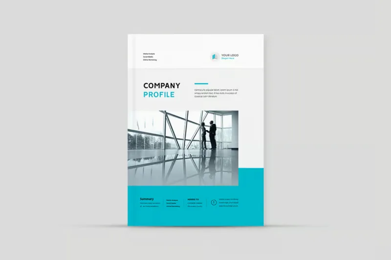
Most businesses treat their company profile as a one-off project: commission it, approve it, distribute it. But without documented company profile design guidelines, the next update — whether it is six months or two years later — results in a document that looks different from the original, feels inconsistent with the website, and quietly erodes brand trust. This guide is your internal mini-manual for company profiles: practical rules for typography, colour, photography, data presentation, and the approval process that keeps every version looking and reading like it came from the same organisation. These are not abstract design principles — they are specific, actionable standards that a non-designer can enforce and a designer can implement without ambiguity.
Voice and Claims Standards
Before pixels and type sizes, the most important guideline for any company profile is about language. Every claim in your profile must be either provable or explicitly softened to opinion. "We are India's leading manufacturer" requires proof. "We are among the established manufacturers in our segment" is honest and defensible. The difference matters not only for credibility but for legal reasons — profiles are often submitted to government and corporate portals where unsubstantiated superlatives can invite scrutiny.
Write in the second or third person depending on your brand tone, but be consistent throughout the entire document. Do not switch between "we" and "the company" mid-profile. Active voice should dominate — passive constructions slow reading and dilute authority. Sentences should average fifteen to twenty words. Paragraph blocks in the body copy should not exceed four lines at your chosen type size, because dense text in a PDF is visually discouraging.
Avoid filler phrases that add length without adding meaning: "a one-stop solution," "your trusted partner," "cutting-edge technology," "world-class services." These phrases appear in virtually every generic company profile and signal a lack of differentiation. Replace them with specific language: what you actually do, for whom, at what scale, with what proof.
Typography Hierarchy
A clear brand typography rules system for profiles uses no more than two typefaces: one for headings and one for body text. Mixing three or more fonts — even if each is individually attractive — creates visual noise that makes the document feel unprofessional. If your brand only specifies one typeface, use weight variation (bold, regular, light) to create hierarchy rather than introducing a second font.
A practical type scale for an A4 company profile looks like this: company name or cover title at 28–36pt; section headings (H2 equivalents in the PDF) at 18–22pt; subheadings at 14–16pt; body text at 10–11pt; captions and footnotes at 8–9pt. These are print sizes — if your profile is digital-only, you can scale up by 1–2pt to compensate for screen reading.
Line spacing (leading) for body text should be 1.3 to 1.5 times the font size. At 10pt body text, that means 13–15pt leading. Tighter leading makes text feel compressed and is harder to read; looser leading wastes page space. Left-aligned text is easier to read than fully justified text in narrow columns, which often creates awkward word spacing in PDFs when automatic hyphenation is not enabled.
Maintain consistent left margins across all pages — 15–20mm for A4 is standard. Headers and footers carrying your logo, page number, and document version should appear on every page except the cover, and should be set in a smaller, lighter weight of your body typeface.
Colour and Contrast Rules
Colour in a company profile serves two functions: brand reinforcement and visual organisation. It should not serve decoration. Define a specific palette for profile use: one primary brand colour (for section headings, accent bars, and key highlights), one secondary colour (for call-out boxes or subheadings), and a neutral set (off-white or light grey for backgrounds, dark grey or near-black for body text).
Pure black (#000000) on white is technically high contrast but can feel harsh in body text. Most print designers prefer a near-black (#1A1A1A or #222222) for body copy, which reads as equally legible but is softer at sustained reading distances. For digital PDFs, contrast ratios matter for accessibility — your body text colour against its background should meet at least a 4.5:1 ratio under WCAG AA guidelines, even if your profile is not a website.
Do not use your primary brand colour as a background for large areas of body text unless the colour is light enough to maintain the contrast ratio. Dark text on a dark-coloured background is one of the most common and damaging design errors in company profiles. When in doubt, use the brand colour for headings and accents, and keep body text on white or very light grey.
Photography Guidelines
Photography is where many company profiles visually succeed or fail. Authentic, high-quality photographs of your team, workspace, products, or services build immediate credibility. Generic stock photography — especially overused images of handshakes, anonymous offices, or diverse-but-clearly-staged teams — does the opposite.
For image resolution for print PDF, every image must be at least 300 DPI at its intended print size. An image that looks sharp on a phone screen may print blurry at A4 size. Always ask your photographer to deliver images at full resolution and resize only after placing in the layout — never enlarge a low-resolution image to fill a larger space.
Maintain consistent photographic style throughout the document. If your team photos use a neutral background, all team photos should use the same background. If your facility photos are bright and high-key, avoid placing a dark, moody product shot two pages later — the visual discontinuity is jarring. If you use colour-grading or overlays on photos (tinting them in a brand colour, for example), apply the same treatment uniformly.
For sections where you do not have suitable photography, use illustrated icons or simple diagrams rather than stock images. A well-designed icon set looks more intentional than a mismatched collection of stock photos, and icons are far easier to update than photography.
Tables and Data Design
B2B company profiles regularly include comparison tables, capability matrices, and data summaries. Poorly designed tables are among the most common readability problems in corporate documents — too many lines, inconsistent column widths, clashing background fills, and tiny type all combine to make data harder to read than a plain prose paragraph.
Design your tables with restraint. Use horizontal rules only — avoid vertical dividers between columns unless the data genuinely requires them (which is rare). Alternate row backgrounds using a very light tint of your neutral (5–10% of your secondary colour, or a very light grey) rather than strong colour banding. Header rows should use your primary brand colour with white or very light text. Body rows should use a near-black or dark grey text on white or near-white backgrounds.
Column widths should be proportional to the content, not equal. A column containing short category labels should be narrower than a column containing paragraph-length descriptions. Left-align text columns; right-align or centre-align numeric columns. Keep table type at least 9pt, and never use a table font smaller than 8pt — if the data does not fit at 8pt, the table needs restructuring, not a font size reduction.
File Naming and Versioning
Consistent file naming is not glamorous, but it prevents real problems. When multiple versions of a profile circulate — to sales teams, on tender portals, in email inboxes — an undated, unversioned file causes confusion about which is current. A standard naming convention removes this ambiguity.
Adopt a convention like: CompanyName_Profile_v2.1_YYYY-MM.pdf. The version number uses the major.minor format: major increments (v1 to v2) for significant content or design updates; minor increments (v1.0 to v1.1) for corrections and small updates. The year-month suffix helps when searching for files in a shared drive. Apply the same convention to source files, drafts, and any print-ready exports.
Keep a simple version log — even a three-column spreadsheet (version, date, summary of changes) — so any team member can quickly understand what changed and when. This is particularly useful if your profile is submitted to long-running tender processes where the evaluating body may refer to an old version.
Revision and Approval Workflow
The revision and approval workflow is the most overlooked element of any design guideline document, and yet it is the one that most directly determines whether your profile reaches a final, polished state or gets stuck in an endless loop of minor edits.
Define revision rounds before the project starts. A standard engagement for a company profile typically includes two structured revision rounds after the first draft: round one for major structural and content changes, round two for fine-tuning and corrections. Changes requested after round two — especially substantial content rewrites — should be treated as a new scope item. This is not bureaucracy; it is what keeps projects moving and prevents scope creep that frustrates both clients and designers.
Use a single feedback document for each revision round. Consolidate all comments from all reviewers into one annotated PDF or shared document before sending to the designer. Sending five separate PDFs from five different reviewers with contradictory comments creates confusion and delays. Nominate one internal decision-maker who has the authority to resolve disagreements between reviewers before feedback is submitted.
For a detailed walkthrough of the full profile creation process, see our guide on company profile design services, which outlines exactly how we structure each project phase.
Maintaining Your Guidelines Over Time
Design guidelines are only useful if they are maintained and consulted. Store your profile design guideline document in the same shared folder as your brand guide, logo files, and profile source files. Review the guidelines whenever you update your brand identity — a colour change or font update at brand level should trigger an update of your profile guidelines. Assign one person — typically the marketing manager or brand owner — as the custodian of these guidelines. Without a named owner, guidelines drift into irrelevance within a year.
Frequently Asked Questions
Can I use my brand's social media fonts in the company profile?
Yes, provided those fonts are licensed for print use and embedded correctly in the PDF export. Some social media or web fonts have licence restrictions that prohibit commercial print use — check the font licence before assuming. If in doubt, use a widely licensed alternative with a similar visual character. Google Fonts, for example, are free for both web and print under the Open Font Licence.
How do I handle multiple languages in a single profile layout?
If your profile needs to present content in both English and a regional language such as Hindi, Telugu, or Tamil, the cleanest approach is a side-by-side column layout for short sections or separate language versions of the full document. Avoid mixing scripts within the same body paragraph — it makes both versions harder to read and complicates hyphenation and line-break logic. Ensure your chosen typefaces include glyphs for all scripts used.
Should company profile pages be numbered?
Yes, always. Page numbers, combined with a clear table of contents on page two or three, make navigation dramatically easier for the reader — especially in longer profiles used in tender submissions. Place page numbers in the footer alongside the document version and company name. Numbering should start from the first interior page (About Us), not the cover page, which is conventionally unnumbered.
What is the ideal PDF file size for email distribution?
Aim for under 5MB for a standard 10–14 page profile. Most corporate email servers have a 10–25MB attachment limit, but smaller files are simply more convenient — they load faster, preview more smoothly in email clients, and are less likely to be rejected by enterprise spam filters. If your profile contains many high-resolution images and the file is over 10MB, ask your designer to export a screen-optimised version specifically for email alongside the print-ready version.
Put Your Guidelines to Work
These guidelines exist to make your profile consistent, credible, and easy to update — whether the work is done by your internal team or an external agency. If you are starting a new profile or refreshing an existing one, the team at Company Profile Design applies these exact principles to every project we take on.
View our company profile design process to understand how we translate brand guidelines into a finished, print-ready document. For more practical writing and design guides, visit our blog.
Consistent design is not a cosmetic concern — it is how your business communicates reliability before a single word is read.