Blog
Business Profile Design vs Company Profile: Same Asset, Different Labels?
By Funky Developers • 2026-05-14
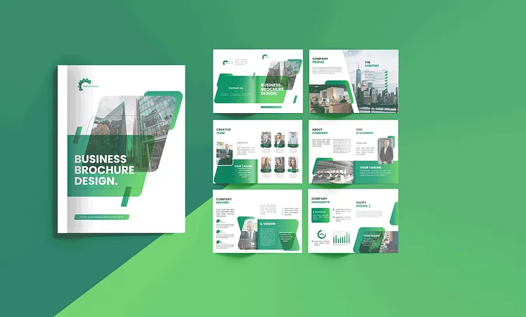
Unpack business profile design versus “company profile” naming, when they overlap, and how to structure a company overview document buyers trust.
Search logs mix two phrases people use for the same panic moment: “We need a business profile design” and “We need a company profile.” Vendors, banks, accelerators, and procurement portals rarely agree on vocabulary. Your job is not to win a terminology debate—it is to ship a credible company overview document that answers who you are, what you sell, how you deliver, and why you are safe to shortlist.
When “business profile” and “company profile” mean the same thing
In most Indian B2B contexts, both labels point to a flagship PDF or booklet: positioning, services, proof, leadership, compliance highlights, and contact. The design system should stay consistent whether sales calls it a business deck appendix or procurement tags it as a vendor profile. If your studio understands that equivalence, you avoid rebuilding the same twelve pages twice under different filenames.
Where language diverges is audience. Some founders say business profile design when they pitch investors; operations teams say “company profile” when they upload tender annexures. One master narrative can serve both if you plan modular spreads: a tight executive summary for speed readers, deeper methodology pages for technical evaluators, and optional financial snapshots gated behind what your CFO approves.
Company overview document: the spine every format shares
Start with an outline, not software. Your company overview document should list mandatory facts first—legal name, year founded, registered offices, key certifications—then layer story. Designers translate that outline into pacing: where to place hero photography, when to switch from narrative paragraphs to scannable tables, how to separate “what we sell” from “how we implement.”
If you also maintain a website, pull single-source facts from there only after you verify dates. Nothing erodes trust faster than a profile that contradicts your own careers page or press section.
SME profile booklet: shorter, still serious
Small and mid-sized firms sometimes assume a slim SME profile booklet signals weakness. The opposite can be true: a focused twelve-page booklet that nails sector proof often outperforms a bloated thirty-page PDF nobody finishes. The design challenge is density without clutter—clear section breaks, readable tables, and photography that feels authentic rather than stock-heavy.
Choose paper weight and binding only after you know distribution. Email-first profiles favour horizontal layouts that read well on laptops; conference leave-behinds may favour portrait booklets with heavier cover stock.
Investor one-pager vs full profile
An investor one-pager is not a lazy version of your profile—it is a different job. Investors want problem, traction, moat, team, and round context in one glance. Your full profile still matters for diligence, but it should extend—not repeat—the one-pager line by line. Designers can align typography and chart styles so both artefacts feel like one brand family.
Brochure vs company profile: overlap and boundaries
Marketing brochures often push campaigns, seasonal offers, or single product lines. A brochure vs company profile comparison is simple: brochures sell moments; profiles sell the firm. You may reuse photography and charts, but the narrative arc differs. Profiles carry governance tone; brochures can carry punchier promotion. If you must merge them for cost reasons, mark sections clearly so procurement readers do not feel marketed to when they wanted neutral facts.
Design choices that help both “business” and “company” readers
Use neutral, confident headlines. Lead with outcomes and sectors before adjectives. Reserve superlatives for places you can substantiate with numbers or third-party validation. Build iconography for repeatable concepts—quality process, safety, delivery geography—so both sales and compliance audiences recognise familiar cues across pages.
Translating internal jargon into clean profile sections
Engineering teams love acronyms procurement has never seen. Sales teams invent product nicknames that never appear in contracts. Part of business profile design is editorial translation: surface plain-language service names in headings, tuck technical depth into subordinate paragraphs or footnotes, and align terms with what appears in your master service catalogue. Designers help by creating glossary-style sidebars only when legal approves definitions.
Case-study spreads when you cannot name the client
Many firms carry NDAs that block logos. You can still show rigour with anonymised narratives: sector, geography, problem class, solution pattern, and quantified outcome ranges your legal team clears. Photography of anonymised sites or generic process imagery—shot on your premises—beats irrelevant stock photos. Layout rhythm here matters: alternating text-led spreads with chart-led spreads keeps evaluators engaged through dense proof.
When to split one overview into two artefacts
If your company overview document tries to serve global partners, domestic tenders, and campus hiring simultaneously, consider a core profile plus short vertical supplements. The core carries governance and group narrative; supplements carry sector stats that change often. Designers can share one visual system across PDFs so the family looks intentional.
Bilingual layouts and regional publication norms
If you publish Hindi or other language callouts beside English, plan for longer strings and different hyphenation. Some states prefer certain formalities in how addresses render. Your SME profile booklet printer may need imposition proofs that differ from a digital-only export. Designers experienced in Indian B2B work build grids that tolerate reflow without breaking paired columns. Decide early whether bilingual content appears on the same spread or mirrored spreads to reduce pagination surprises.
Charts, footnotes, and the politics of rounding
Numbers tell stories, but rounding rules differ across teams. Finance may insist on one decimal; marketing prefers integers for scannability. Decide before layout locks. Footnotes should carry methodology (“CAGR based on audited consolidated statements”) so designers can reserve space without shrinking body copy illegally. Consistent chart colours across business profile design and investor decks reduce “which version is true?” moments in diligence.
Recycling content across brochures, decks, and the web
Reuse paragraphs carefully. Web copy often uses shorter sentences; tender copy may need passive constructions legal prefers. When you lift blocks into your company overview document, re-linebreak for print readability and re-check numbers. Designers can mark reused modules in the layout file so you know which spreads must update together when a fact changes. This discipline keeps your brochure vs company profile boundaries clear even when photography overlaps.
International comparisons without sounding generic
If you serve export markets, you may reference global standards. Keep claims specific—region, year, certifying body—rather than vague “world-class.” Designers can add light map graphics or small flag callouts when helpful, but avoid cluttering SME profile booklet spreads with decoration that does not answer buyer questions. Pair international claims with domestic delivery proof so Indian procurement teams still see relevance.
Translation and localisation partners
If you plan multilingual editions, involve translators before final pagination. They need context for ambiguous English (“plant” could mean factory or vegetation in edge cases). Designers should receive translation memory exports or glossaries so repeated technical terms stay consistent. Budget extra QA time for right-to-left scripts if you ever expand—early grid choices in English should not block future languages. Even single-language business profile design benefits when writers flag idioms that confuse non-native readers in multinational consortia.
Optional appendix: glossary and acronym control
Heavy engineering or pharma profiles drown readers in TLAs. A two-page controlled glossary—designed, not a raw spreadsheet—helps evaluators who did not attend your sales calls. Keep it skimmable: term, plain-language definition, owning function. Update it when product names change. Designers can style glossary pages differently so they feel reference-like, not part of the narrative flow, keeping your investor one-pager clean while the long PDF carries depth.
Passwords, restrictions, and portal security
Some teams password-protect draft PDFs; others avoid passwords because portals strip them. Decide policy early. If you use restrictions that block copying, remember procurement teams sometimes need to paste tables into compliance worksheets—overlocking frustrates partners. Watermarks on drafts reduce leak risk without blocking legitimate excerpts your sales team needs internally.
FAQ
Should we maintain two files with different names?
If audiences differ materially—investor one-pager versus tender pack—yes. If only the filename differs, you waste maintenance effort.
Can we embed video in a profile?
PDF video support is inconsistent. Prefer links to controlled landing pages unless your portal explicitly allows rich media.
Do we translate for regional partners?
Plan layout expansion early. Hindi, Tamil, or Marathi copy often changes line breaks; designers need extra space or alternate grids.
Day-zero asset pack: what to zip before kickoff
Send vector logos for every sub-brand you might mention, not only the parent mark. Include monochrome reverses for dark photography backgrounds. Package fonts or confirm Google-font equivalents your IT allows. Add a spreadsheet of services with one-sentence definitions finance agrees on. Drop in three anonymised project stories with metrics—even rough—so writers and designers understand proof density. Include photography with rights metadata, not mystery downloads from old campaigns.
Add a single “non-goals” paragraph: positioning you are abandoning, markets you refuse to imply you serve, claims legal has banned. That negative space saves days of rework. If you maintain multiple addresses, mark which appear publicly versus tender-only. Designers use this pack to calibrate business profile design pacing before they spend emotional energy on the wrong hero narrative.
How to brief a designer when your story keeps changing
Many founders and marketing leads hesitate to start a business profile design project because the company itself is evolving—a merger is pending, a new product line is in soft launch, or leadership wants to reposition for a different vertical. The instinct to wait for stability is understandable but often counterproductive. The profile project itself can force the strategic clarity you need. Briefing a designer requires you to commit to how you describe your services, who your target clients are, and what proof you are willing to show publicly. These decisions sharpen positioning in useful ways that slide decks rarely demand.
The practical answer when things are shifting: distinguish between frozen inputs and provisional ones. Legal name, incorporation date, registered address, and certifications are frozen—they go into the first brief. Services under review, a leadership hire pending announcement, or a sector strategy under board review are provisional—hold them for now, design around what is confirmed, and plan a narrow revision sprint when facts land. Build your company overview document in a way that allows section-level updates without reflowing the whole file. Studios that understand modular grid systems can deliver this cleanly; those that design as a single rigid object cannot.
When multiple decision-makers hold conflicting positioning views, a facilitated brief session with the designer present often unlocks agreement faster than internal slide debates. Designers reflect back contradictions visually—when two messaging strategies produce incompatible spreads, stakeholders understand the trade-off viscerally. That visual mediation is an underrated benefit of working with a professional studio rather than a template tool. The brief session doubles as a strategy alignment meeting, and the profile that emerges carries buy-in that a top-down-imposed document rarely achieves.
Keeping business profile design current across teams
Profiles decay not in one dramatic event but gradually—one stale metric on page seven, one outdated leadership photo on page twelve, one service name that changed in a reorg nobody told marketing about. By the time a tender evaluator notices, you have already lost credibility points. Governance is the only remedy. Assign a profile custodian—usually a marketing operations role or a corporate communications lead—who owns a simple maintenance log: what changed, when, and who approved the update. That log feeds the next refresh brief so the designer is not starting from scratch each time.
Quarterly check-ins work better than annual redesigns for most growing firms. Finance updates revenue band labels. HR confirms headcount and adds new offices. Operations confirms certifications have not lapsed. Sales flags new case patterns approved for public use. Each of these is a small file change, not a full campaign. Your SME profile booklet or full corporate document should include a one-page update protocol—a standing-item template your custodian runs through quarterly with each department head. Treat it the way you treat product documentation: live, versioned, and owned.
When a major structural change happens—new brand, new ownership, new market entry—budget a full redesign rather than patching new content onto an old system. Patches accumulate technical debt in layout files and visual inconsistency in exported PDFs. A clean redesign amortises quickly when every deal team switches to the same refreshed file rather than continuing to circulate six variants from the last three years. The investor one-pager that triggered a board approval in the same quarter as a tender win proves that investment twice in one reporting period.
When your company story changes mid-project
Acquisitions, leadership transitions, strategic pivots, and regulatory approvals happen mid-project more often than founders expect. When they do, the worst response is to either ignore the change and ship an outdated document, or halt everything until the new chapter is fully written. A better response: build a modular revision plan. Sections that carry the new development—a new product line, a changed leadership team—get placed on hold while the rest of the company overview document advances. When facts lock, you run a targeted revision sprint on the affected spreads without restarting the whole project.
Designers who understand modular grid systems make this easier. Spreads designed as contained modules—not as long continuous scrolls—can be updated, moved, or swapped without affecting the neighbouring pages' layout logic. If your studio builds the file as a single continuous flow, mid-project pivots cascade expensively. Ask for modular architecture in the brief. This structural choice also extends the document's useful life, because individual sections can refresh on different schedules when marketing, operations, and finance all own different page groups with different update cadences.
Build one flagship narrative
Whether your leadership calls it business profile design or a company profile, the deliverable is the same: a document that survives scrutiny. We build layouts, copy support, and production files around how you actually win work. Start with company profile design to see how we scope modules, revisions, and export formats.
If you already have a rough company overview document and need it elevated visually, share it—we will show how structure and hierarchy can change first impressions without inventing new claims. For ongoing tips, see our blog index.
When you are ready to commission work, book company profile design services through our service page so procurement and marketing share one timeline.
Related: how to create a business profile · company profile design services · how to create a company profile.