Blog
Annual Report Design Checklist for Better Readability
By Studio Team • 2026-02-20
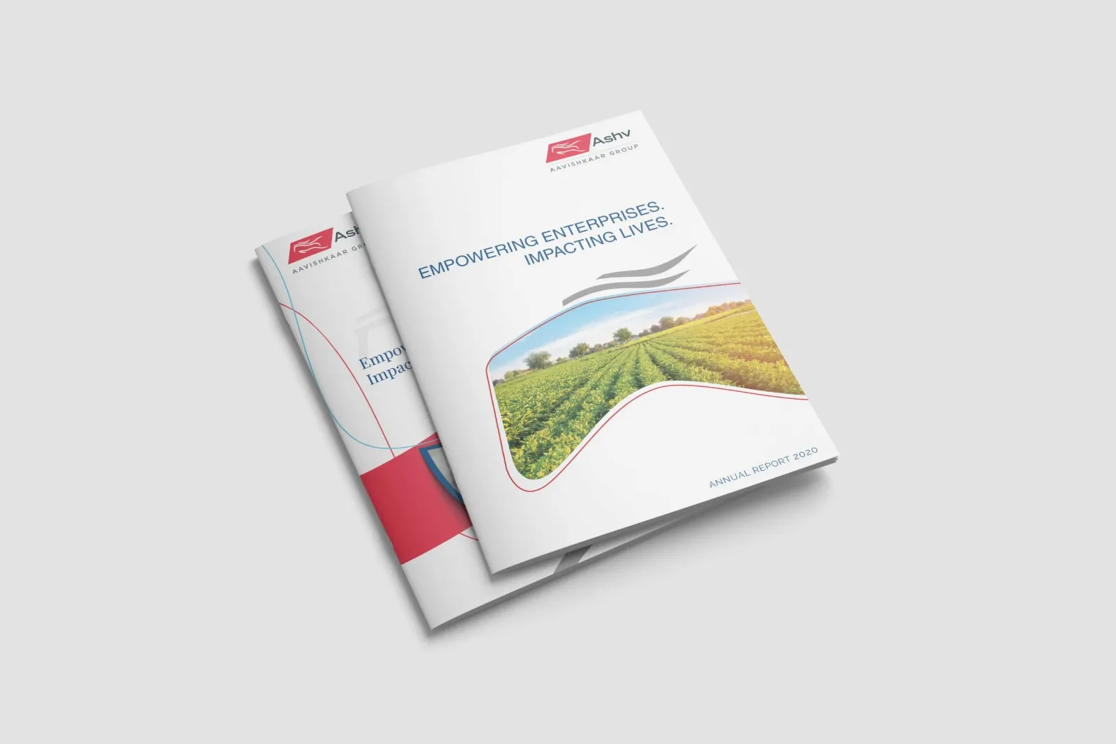
Use spacing, typography hierarchy, and information flow rules to make long annual reports easier for investors and management teams to read. This checklist is used by our annual report design studio for every project.
Why Readability Wins in Annual Report Design
Investors and board members skim annual reports — they rarely read linearly. Your annual report design must guide the eye, surface the key numbers fast, and reward closer reading with layered detail. Poor typography kills credibility before the content is even read.
Annual Report Design Readability Checklist
- Use a maximum of 2 typeface families — one for headings (Unbounded, Neue Haas), one for body (Plus Jakarta Sans, Inter).
- Set body text at 9–10pt for print, 16px for digital. Never smaller.
- Use a baseline grid — 12px increments keep financial tables and body text aligned.
- Give each section a distinct colour accent — readers use colour to orientate themselves in long documents.
- Design financial tables with adequate column gutters — cramped numbers are misread.
- Add pull quotes and callout stats to break up long text sections.
- Every chapter opener should communicate the section theme in under 5 seconds.
How Our Annual Report Design Studio Applies This
Every annual report we design starts with a typography and colour system review before a single page is laid out. This system doc becomes the handoff reference for all future updates.
For studio-led annual report design with per-page pricing and GST billing, see our annual report design service.
For studio-led delivery, hire our company profile design agency.