Blog
Cover Page Ideas for Business Profile Design (Print and PDF)
By Funky Developers • 2026-07-11
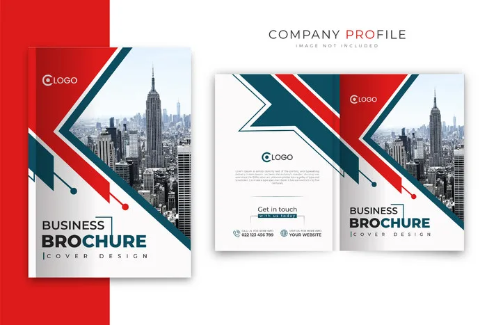
Practical cover page ideas for business profile design — typography-led, photography, minimal, and illustration styles with technical print and PDF requirements.
The cover page of a business profile is the only part of the document that every reader sees before deciding whether to open it. In print, it is handled, felt, and assessed in under five seconds. In digital form, it is the thumbnail that determines whether the attachment gets opened or deferred. Despite its importance, cover design is routinely underinvested — treated as a background-plus-logo exercise rather than a deliberate design decision that sets expectations for everything inside. These cover page ideas for business profile design go beyond generic inspiration to cover specific approaches, their appropriate contexts, technical requirements for print and digital, and the mistakes that undo otherwise good design.
Why the Cover Sets Expectations
Before a reader processes a single word inside your business profile, the cover has already communicated something. A cover that uses poorly kerned type over a stock image downloaded at 72dpi signals that the organisation does not have high standards for its own presentation. A cover that uses confident, well-spaced typography over a precisely cropped, high-resolution photograph signals the opposite. These are not conscious judgements — they are fast, automatic, and difficult to override with good content later.
The cover also functions as a context signal. A spare, typographic cover with restrained colour conveys a different organisational character than a full-bleed photography cover with bold brand colour. Neither is objectively correct — but each is appropriate for different types of organisations and different audiences. A law firm's cover should feel different from a technology startup's. A manufacturing company's cover should feel different from a design agency's. The cover design should be calibrated to the audience's expectations of the category, then elevated enough to stand out within it. In print contexts, paper weight, lamination, and special finishes add a tactile dimension — a soft-touch matte cover communicates investment in the document from the moment it is picked up.
Typography-Led Cover Ideas
A company profile cover typography approach — where type is the primary design element rather than photography — is one of the most versatile and professionally reliable cover design choices for B2B businesses.
The pure typographic cover uses large-scale type set in a deliberate, considered arrangement to create visual impact without relying on imagery. This works best when the company name itself has visual weight, when the brand typeface is distinctive, or when the company's identity is built on thought leadership and authority rather than visual spectacle. Law firms, consulting practices, financial services companies, and B2B technology companies often benefit from this approach.
Typographic hierarchy on a cover should have exactly two or three levels: company name (largest and most prominent), tagline or descriptor (secondary, supporting), and document type or date (smallest, optional). Adding more levels creates visual competition that reduces the impact of any single element.
Colour field typography covers — a solid brand colour background with white or contrasting type — are highly effective for print, particularly when combined with a spot UV or gloss varnish on the typography itself. This creates a subtle but tactile depth that photographs reproduce poorly in digital previews but makes a strong impression in person.
Do: Use a typeface with strong character at large sizes. Set generous letter-spacing on display type for print. Ensure sufficient contrast between type colour and background. Don't: Combine more than two typefaces on a cover. Use default system fonts for B2B cover design. Set body-weight type at cover sizes — it will appear weak and spindly.
Photography-Led Covers
A hero image cover uses a single, full-bleed photograph as the primary visual element. This is the most commonly attempted cover approach and, when done well, one of the most impactful — and when done poorly, one of the most damaging to a profile's perceived quality.
The key word is "single." One photograph at full bleed, confidently chosen and precisely cropped, is almost always stronger than multiple images collaged together, images with complex gradient overlays, or images placed in decorative shapes. The confidence of a single, well-chosen image signals that the organisation knows its own visual identity.
Photography selection matters enormously. The image should be high resolution (300 dpi minimum for print), relevant to the organisation's sector, and composed with space for title placement — typically a darker region where light-coloured typography remains legible. Images without such a region require an overlay treatment, which works when purposeful but not as a generic dark vignette over a busy image.
For manufacturing companies, strong facility or product photography works well. For professional services, candid team or workspace photography conveys approachability. For technology companies, abstract imagery can work when executed with sophistication. Avoid generic business stock (handshakes, people pointing at whiteboards), low-resolution exports, and images with distracting backgrounds.
Illustration and Graphic Covers
Illustration and graphic-pattern covers are less common in B2B profile design and, when used appropriately, stand out precisely because of that rarity. They work best for technology companies, design-adjacent businesses, creative services, and organisations whose brand identity has a distinctive illustrative component.
A geometric or abstract pattern cover — built from the brand's visual language of shapes, colours, and forms — communicates visual identity system depth. It signals that the organisation has invested in a coherent visual brand beyond a logo and a colour. This is particularly effective for businesses that are newer and do not yet have a substantial photography library — a custom graphic cover can be highly polished without requiring photography.
Custom illustration covers — where a scene, character, or conceptual illustration is designed specifically for the profile — are a significant investment but can produce genuinely distinctive results for the right organisation. They are most appropriate when the business has a clear, distinctive brand personality that illustration can express better than photography.
The technical requirements are identical to photography covers: 300 dpi in CMYK with proper bleeds for print, and sufficient resolution for digital screen rendering. Vector elements scale without quality loss; raster illustration elements must be set at full output resolution before export.
Minimal and Clean Covers
A minimal cover design uses restraint as its primary design statement — large amounts of white (or light-coloured) space, a single strong brand element (logo, a short tagline, a single graphic mark), and confident use of emptiness to create visual impact through contrast.
Minimal covers are particularly effective for professional services, advisory businesses, high-end B2B technology, and organisations whose brand positioning is built on precision and clarity rather than scale or complexity. The implicit message of a minimal cover is that the organisation is confident enough not to need visual spectacle to make an impression.
Executing a minimal cover well requires more discipline than it appears to. Every element that remains must be perfectly placed — typography must be impeccably set, spacing must be considered and intentional, and the brand mark must be strong enough to anchor the composition on its own. A minimal cover with poorly set typography or misaligned elements looks careless rather than confident. The tolerance for imprecision is lower, not higher, than in more complex designs.
For print, minimal covers benefit significantly from special finishes — spot UV over the logo on a matte field, or soft-touch lamination on a clean white cover. The physical quality these finishes produce is not fully captured in digital previews, which is precisely why they matter for high-stakes print contexts.
Print Finish Options
Understanding print cover finish options is important for anyone commissioning a business profile that will be printed for formal use. The finish choice affects both the cost and the perceived quality of the final product.
Matte lamination is the most widely used B2B cover finish. It provides a non-reflective surface that feels sophisticated in the hand and is relatively resistant to fingerprints. Matte lamination works well with both photographic and typographic covers and is appropriate for virtually all B2B contexts.
Gloss lamination provides a reflective, high-contrast surface that makes colours appear more saturated. It is appropriate for profiles where visual vibrancy is important — consumer-facing brands, architecture and design companies, hospitality businesses. For conservative B2B sectors (finance, legal, government), gloss lamination can read as less serious than matte.
Soft-touch matte lamination (sometimes called velvet lamination) has a silky, slightly rubberised texture that is considered a premium finish. It is more expensive than standard matte but produces a strong tactile impression that is distinctly different from paper alone. Many high-end corporate profiles use soft-touch as their standard cover finish.
Spot UV involves applying a clear gloss coating to specific elements — a logo, a title, a graphic element — on an otherwise matte surface. The contrast between matte and spot-gloss areas creates visual and tactile interest without adding the cost of full-gloss lamination. It works particularly well on minimal covers where the restrained aesthetic is complemented by a subtle physical texture rather than colour or imagery.
Technical Requirements for Print and PDF Covers
Whatever design approach you choose, print cover finish options and digital PDF delivery have specific technical requirements that must be met for the cover to reproduce correctly.
For print: Design at 300 dpi minimum. All colours in CMYK, not RGB. Include a 3mm bleed on all four sides — background colours, images, and edge elements must extend beyond the trim line to prevent white edges appearing after cutting. Set all fonts to "outline" or embed them in the exported file. Export as PDF/X-1a or PDF/X-4 format. Confirm the cover and inner pages are in separate files if the printer requires them, or in a collated print-ready PDF if they can handle combined files.
For digital PDF: Export as a separate screen PDF at 144 dpi (sufficient for screen display, significantly smaller file size than print resolution). Convert colours to sRGB for accurate screen rendering. Add interactive bookmarks to allow navigation. Ensure the cover is the first page visible when the PDF opens. Check that the file opens at the correct page orientation in common PDF readers (some landscape documents default to portrait view).
Title placement on the cover should account for both print binding and digital thumbnail. For print, check that the title is not obscured by the binding spine — allow at least 15mm of clear space from the left edge for perfect-bound or case-bound covers. For digital thumbnails, ensure the title is legible at the small preview sizes used in email clients and cloud storage previews.
Common Cover Page Mistakes
These are the recurring cover design errors that undermine otherwise well-designed profiles — along with how to avoid each one.
Low-resolution imagery. A blurry or pixelated image on the cover is visible immediately and damages the document's credibility before a single page is opened. Any image used in print must be at 300 dpi at the intended print size — not at the screen resolution it appeared at online.
Mismatched visual identity. A cover that does not reflect the brand's colours, typography, or visual character creates cognitive dissonance for readers who already know the brand. The cover should be the strongest expression of the brand, not an exception to it.
Too many typefaces. Two is almost always the maximum. Three or more typefaces on a cover create visual noise. If your brand has one typeface family, use it exclusively on the cover — the different weights and styles within one family provide sufficient variety.
Insufficient contrast for title legibility. A light title on a light background, or a dark title on a dark image region, will fail legibility tests — especially in print where screen brightness does not compensate for low contrast. Verify contrast in a physical print proof, not only on screen, before approving the final file.
Frequently Asked Questions
What image resolution is required for a print business profile cover?
300 dpi at the final print size is the minimum standard for commercial offset printing. RGB images must be converted to CMYK before print, and the colour shift should be reviewed with a physical proof — some colours, particularly deep blues and bright reds, shift significantly in CMYK conversion. If only a lower-resolution image is available, minor upscaling (up to 20%) using AI tools can work but should always be verified with a proof before approving a full print run.
Should the cover design be different for print and digital versions?
The design concept can be identical, but the technical execution differs. Print requires CMYK colours, 300 dpi resolution, bleeds, and crop marks. The digital PDF version should be sRGB, lower resolution for file size, and may include hyperlinks and bookmarks. For photography covers with title text, verify that the text remains legible at thumbnail preview sizes used in email clients — what reads clearly at A4 can become unreadable at thumbnail scale.
How much should I spend on special print finishes for a business profile cover?
Match the finish quality to the context and stakes of use. For high-stakes, low-volume print runs (tender submissions, board presentations — 20 to 50 copies), premium finishes like soft-touch lamination or spot UV are worth the incremental cost. For high-volume general sales distributions (200+ copies), standard matte lamination is appropriate and cost-effective. Calculate cost per copy and decide accordingly rather than applying a blanket standard across all print runs.
Can a company logo alone make a strong cover?
It can — on a minimal cover with a very strong, distinctive logo and a carefully chosen background colour. This works particularly well for established brands whose logo is immediately recognisable in their market. For newer or less visually distinctive brands, relying on the logo alone typically results in a cover that appears incomplete rather than confidently minimal. In most cases, a well-chosen tagline or brief descriptor adds necessary context without cluttering the minimal aesthetic.
What is a safe title placement zone for print cover pages?
For perfect-bound (glue-bound) covers, keep all text at least 15mm from the left edge and 10mm from all other edges to avoid the binding area. For spiral-bound covers, the left margin should be at least 20mm to account for the binding holes. For all print covers, keep text within the "safe area" — the region that falls inside the trim line after cutting, at least 3mm inside the bleed edge. Your designer should include a safe area guide in the design file and verify placement before print file delivery.
Start With a Cover That Commands Attention
The cover page of your business profile is the one element that no reader skips. Investing in a cover design that is visually confident, technically correct for both print and digital, and calibrated to your audience's expectations is the fastest way to improve how your entire profile is received before a single internal page is read.
Explore our business profile design services to see how cover design, layout, and content work together for B2B organisations across India. Whether you need a complete new profile or a focused cover redesign, our profile design process includes print-ready file delivery for all formats. For more on what makes an effective company profile, explore our design strategy articles.
---